Responsive Website Design in Dubai for Every Screen
People in Dubai use their phones, tablets, and computers to find businesses, compare services, and make purchasing decisions. Whether someone is searching for a restaurant in Business Bay, a property consultant in Dubai Marina, or a glass supplier in Al Quoz, they expect a website that works properly on their device. If your website is difficult to navigate on a mobile phone, visitors may leave before they even learn what your business offers.
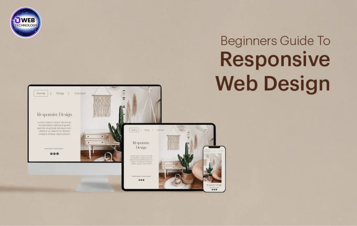
Responsive Website Design helps solve this problem by allowing your website to adjust automatically to different screen sizes. Your content, images, menus, and buttons remain organised whether a visitor opens your website on a smartphone, tablet, laptop, or desktop computer.
For businesses across Dubai and the UAE, a responsive website is a practical way to improve the customer experience and present a professional online image. At WebTechnolgy, we help businesses build websites that are easy to browse, simple to use, and designed around their customers’ needs.
What Is Responsive Website Design?
Responsive website design is an approach to web development that allows a website to adapt to the screen on which it is viewed. Instead of creating separate websites for desktop and mobile users, developers build one website that adjusts its layout according to the available screen space.
For example, a desktop website might display three service boxes side by side. On a mobile phone, those same boxes can appear vertically, making them easier to read and tap. Images resize, text remains readable, and navigation menus adapt to smaller displays.
A responsive website also helps businesses maintain a consistent brand identity. Customers see the same logo, colours, service information, and contact details regardless of the device they use.
How Does Responsive Design Work?
Responsive design combines several web development techniques to create a flexible layout.
These elements work together to provide a smoother browsing experience for visitors across different devices.
Why Businesses in Dubai Need Responsive Website Design
Dubai has a competitive business environment where customers often compare several companies before contacting one. A website that looks outdated or becomes difficult to use on mobile devices can create a poor first impression.
Imagine someone searching for an interior design company while travelling between appointments. They open your website on their phone but cannot read the service details or find the WhatsApp contact button. They may simply visit another company’s website.
A responsive website makes it easier for potential customers to find the information they need and take the next step.
Reach Customers Who Browse on Mobile Devices
Mobile visitors may want to check your location, view your portfolio, compare prices, or request a quotation. A mobile-friendly layout allows them to complete these actions without constantly zooming in or scrolling sideways.

This is particularly useful for local service businesses, restaurants, construction companies, retailers, and professional service providers.
Create a Professional First Impression
Your website often introduces your business to potential customers before they speak to your team. A clean, consistent layout helps communicate professionalism and makes your company easier to trust.
For businesses serving Dubai’s diverse customer base, clear navigation and straightforward service information can make a meaningful difference.
Make It Easier for Customers to Contact You
A responsive website can place important actions where visitors can find them easily. These may include
When these features work properly on mobile devices, customers can contact your business with fewer steps.
Mobile-Friendly Website Design: What Should Your Website Include?
Mobile-Friendly Website Design focuses on making a website convenient to use on smartphones and other smaller screens. It is closely related to responsive design, but the mobile experience deserves special attention during planning and development.

A website may technically fit a phone screen and still be difficult to use. Text might be too small, buttons too close together, or important information hidden beneath oversized images.
Here are some features worth considering when developing a mobile-friendly website.
Simple Navigation and Clear Buttons
Mobile users should be able to find your main pages without opening complicated menus. Keep navigation labels short and organise pages logically.
Buttons such as “Get a Quote,” “Contact Us,” and “View Our Services” should be easy to identify and tap. Avoid placing multiple clickable elements too close together.
Fast Loading Pages
Large images, unnecessary animations, and poorly configured plugins can slow down a website. Slow pages can frustrate visitors, especially when they are browsing through a mobile connection.
To improve loading performance, developers can compress images, use modern image formats, reduce unnecessary scripts, enable caching, and choose reliable hosting.
Readable Content and Well-Placed Images
A mobile layout should not force visitors to zoom in to read basic information. Use suitable font sizes, comfortable line spacing, clear headings, and short paragraphs.
Images should support the content rather than push important information too far down the page. For example, a glass supplier can display product images alongside concise descriptions and an easy-to-find enquiry button.
Easy-to-Use Contact Forms
Long forms can discourage mobile visitors from submitting enquiries. Ask only for the information your business genuinely needs.
A simple form might request a customer’s name, phone number, email address, and a brief description of their requirements. Test every field and submission button before publishing the website.
Benefits of Responsive Website Design
Responsive design offers practical advantages for businesses that want to provide a consistent experience across devices.
1. Better User Experience
Visitors can browse your website comfortably without struggling with tiny text, oversized layouts, or broken page elements. A smoother experience makes it easier to explore your services and find answers.
2. Support for SEO Performance
Google primarily uses the mobile version of website content for indexing. A responsive website helps maintain consistent content across desktop and mobile layouts, making it easier to manage your website’s SEO.
Responsive design alone does not guarantee higher rankings. Search visibility also depends on content quality, page speed, technical SEO, relevance, and other factors.
3. Easier Website Maintenance
With a single responsive website, your team can manage one set of pages rather than maintaining separate desktop and mobile versions.
This simplifies routine updates to service descriptions, contact information, images, and landing pages.
4. More Opportunities for Customer Enquiries
When contact buttons, forms, and service details work properly on every screen, visitors have a clearer path to getting in touch.
For example, a Dubai maintenance company could make its phone number and quotation form accessible near the top of its mobile homepage. This allows visitors to enquire without searching through several pages.
5. Consistent Branding Across Devices
Your website should represent your business consistently, whether a customer views it on a large office monitor or a small smartphone.
Responsive design helps preserve your brand colours, logo, typography, images, and overall presentation across different screen sizes.
6. Better Support for Future Growth
As your business adds new services, product categories, or landing pages, a properly planned responsive website provides a flexible foundation for those changes.
It can also support new devices and screen sizes without requiring a completely separate website for each one.
Our Responsive Website Design Process
At WebTechnolgy, we believe a website should be planned around the business and the people who will use it. Our approach focuses on clear communication, practical design choices, and testing before launch.
Step 1: Understand Your Business
We begin by learning about your services, target customers, competitors, and website goals. A business looking for local enquiries may need a different layout from an online store selling products across the UAE.
Step 2: Plan the Website Structure
We organise the pages, navigation, calls to action, and content sections. This helps visitors understand what you offer and find relevant information without unnecessary effort.
Step 3: Design for Multiple Screens
We develop a layout that adapts to mobile phones, tablets, laptops, and desktops. Images, menus, headings, and content sections are adjusted to suit different screen widths.
Step 4: Develop and Optimise
During development, we focus on responsive layouts, readable content, sensible image sizes, and essential website functionality. Where required, we also implement SEO-friendly page structures and contact integrations.
Step 5: Test Before Launch
We check key pages, menus, forms, images, and buttons across different screen sizes. We also review loading performance and look for layout issues that could affect the visitor experience.
Our goal is to provide a website that is practical for your customers and manageable for your business.
Why Choose WebTechnolgy for Responsive Website Design?
Choosing a website development company involves more than comparing designs. You need a team that understands your requirements and can build a website around your business objectives.
At WebTechnolgy, we provide website design and development services for businesses looking to establish or improve their online presence.
Here is what you can expect from our approach
We understand that businesses have different budgets and priorities. Whether you need a new company website or want to improve an existing WordPress website, we can discuss a suitable approach.
Responsive Website Design Services Across Dubai and the UAE
WebTechnolgy works with businesses looking to build a stronger online presence in Dubai and other parts of the UAE. Our website planning considers the needs of local customers, including clear service information, accessible contact options, and layouts that work well on mobile devices.
We can discuss website requirements for businesses in areas such as
We also welcome enquiries from businesses in Sharjah, Ajman, Abu Dhabi, and other UAE locations.
A website for a trading company may need detailed product categories and quotation forms, while a restaurant may benefit from a mobile-friendly menu, location details, and reservation options. We consider these differences when planning the website.
If you are looking for a responsive website for your UAE business, contact WebTechnolgy to discuss your requirements.
Frequently Asked Questions
1. What is responsive website design?
Responsive website design allows a website to adjust its layout, images, text, and navigation to different screen sizes. It helps visitors use the website on mobile phones, tablets, laptops, and desktop computers.
2. Why is responsive website design important for SEO?
Google primarily uses the mobile version of a website’s content for indexing. Responsive design helps provide consistent content across devices and supports a better user experience. However, good rankings also require relevant content, technical optimisation, and other SEO best practices.
3. What is the difference between responsive and mobile-friendly website design?
Responsive design automatically adjusts the layout to different screen sizes. Mobile-friendly design is a broader term for making a website easy to use on mobile devices. A responsive website is generally an effective way to deliver a mobile-friendly experience.
4. How much does responsive website design cost in Dubai?
The cost depends on the number of pages, design requirements, website functionality, integrations, and content needs. A simple business website usually requires less work than a large e-commerce website or a custom web application. Contact WebTechnolgy for a quotation based on your requirements.
5. Can my existing WordPress website be made responsive?
In many cases, yes. The work may involve adjusting the theme, improving Elementor layouts, fixing mobile spacing, resizing images, updating menus, and testing forms. If the existing website has major technical or structural problems, a redesign may be a better option after reviewing it.
Conclusion
Your website should make it easy for customers to understand your services, explore your offerings, and contact your business. If visitors struggle to use your website on their phones, you could be missing opportunities to connect with potential customers.